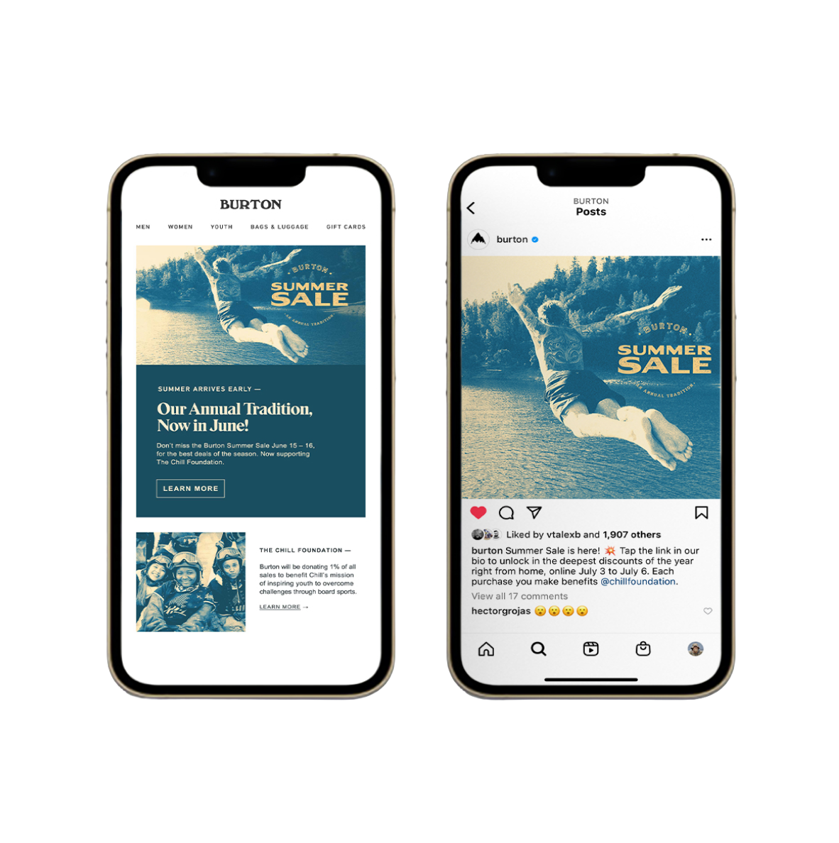
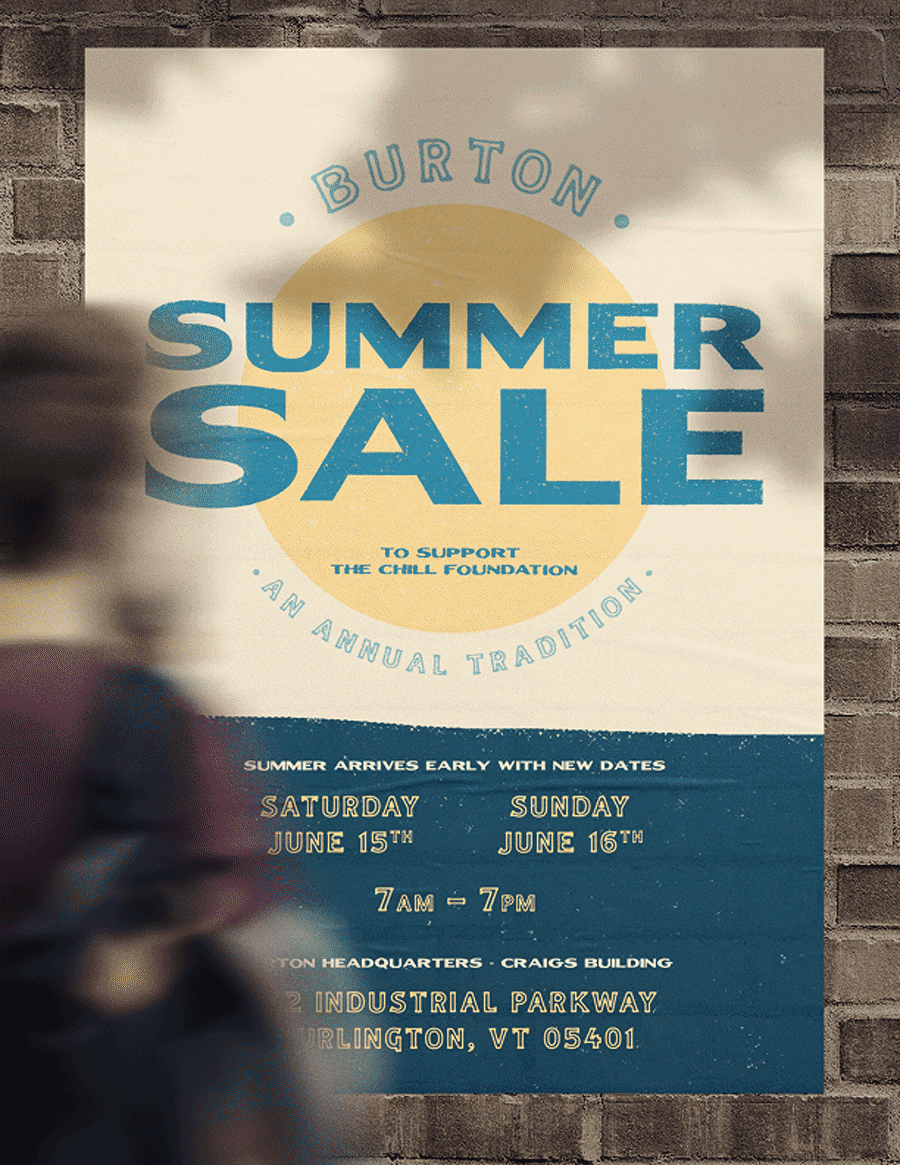
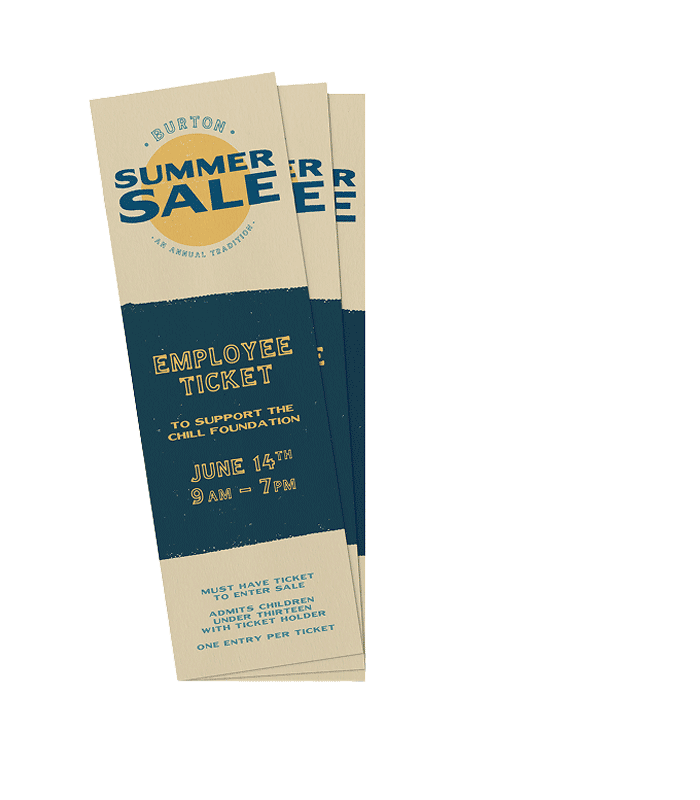
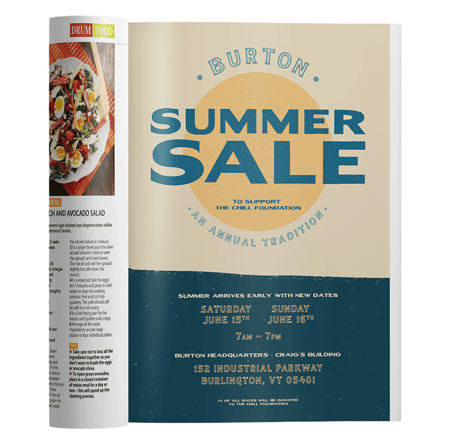
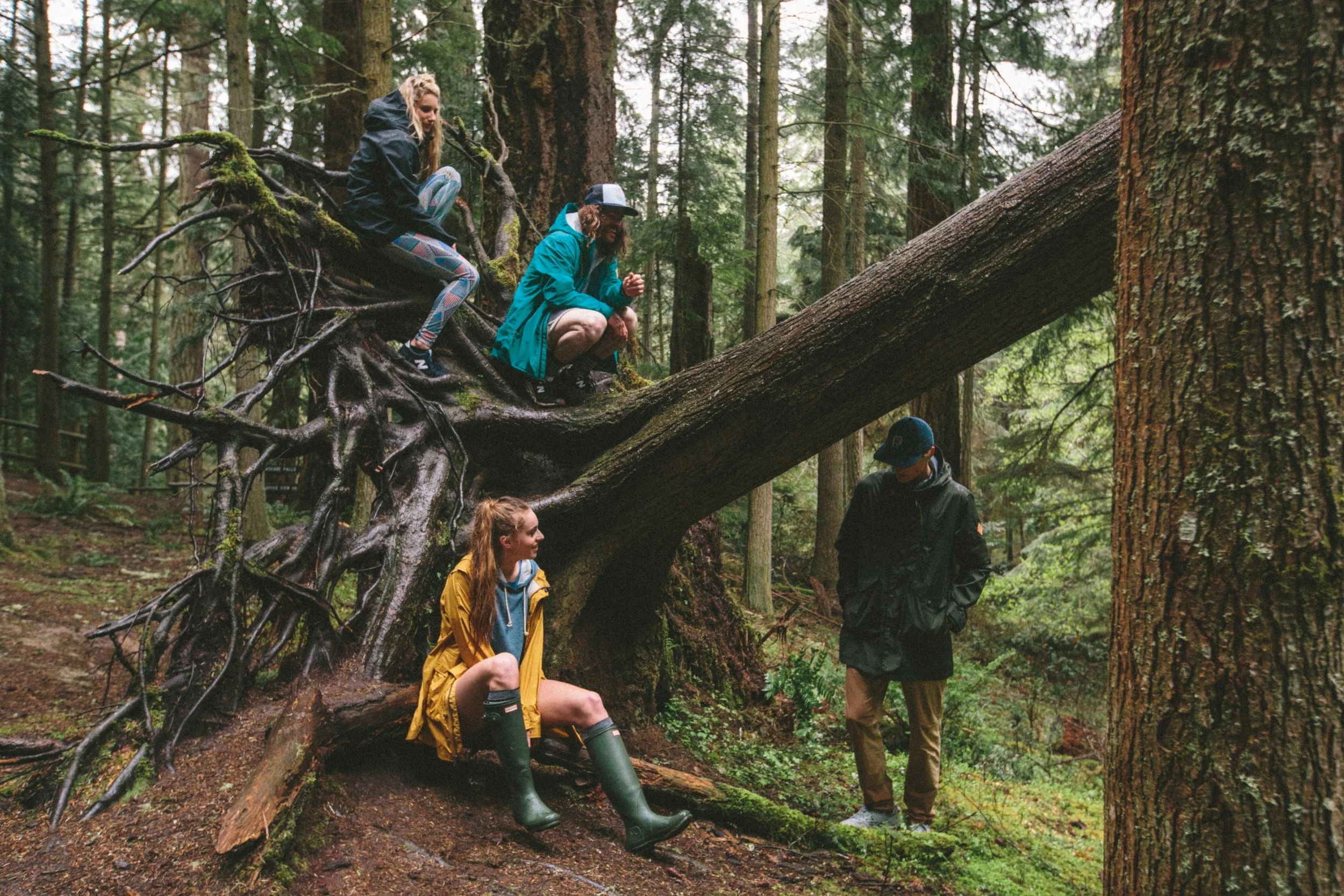
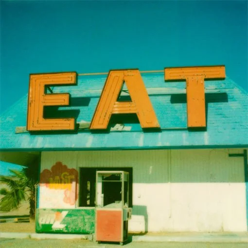
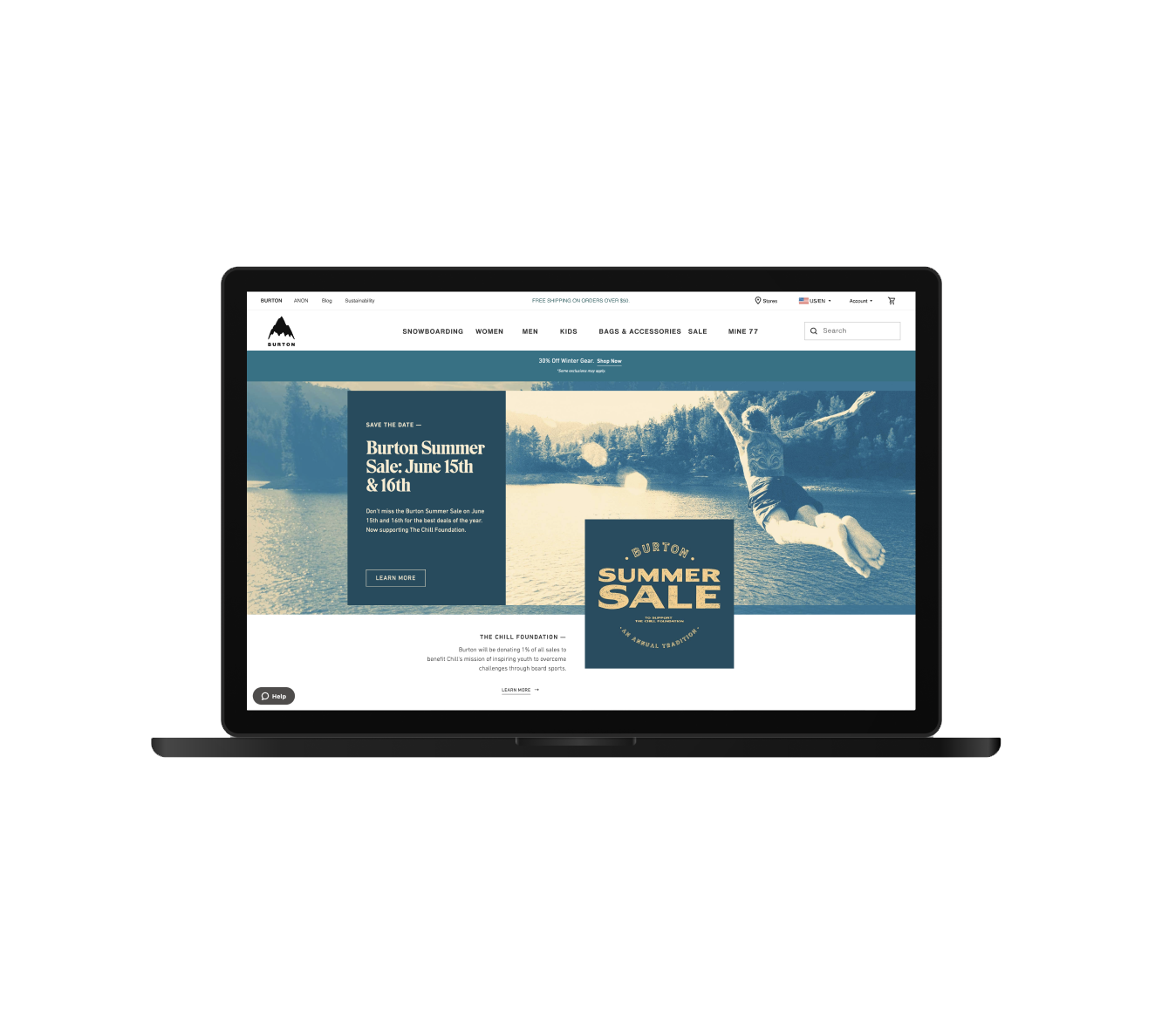
A long-term visual system designed to evolve over 3–5 years, built on warm, vintage-inspired typography, distressed graphic elements, and sun-worn photography. The goal was to create a Summer Sale identity that feels familiar, effortless, and rooted in real seasonal moments. Flexible across digital, in-store, and out-of-home placements, the system maintains consistency while allowing for variation, keeping the campaign recognizable without feeling repetitive.
A long-term visual system built to live for 3–5 years, using warm, vintage-inspired typography, distressed graphic elements, and sun-worn photography to create a recognizable, timeless Summer Sale identity.
Turning Summer Sale into a brand, not just
a promotion
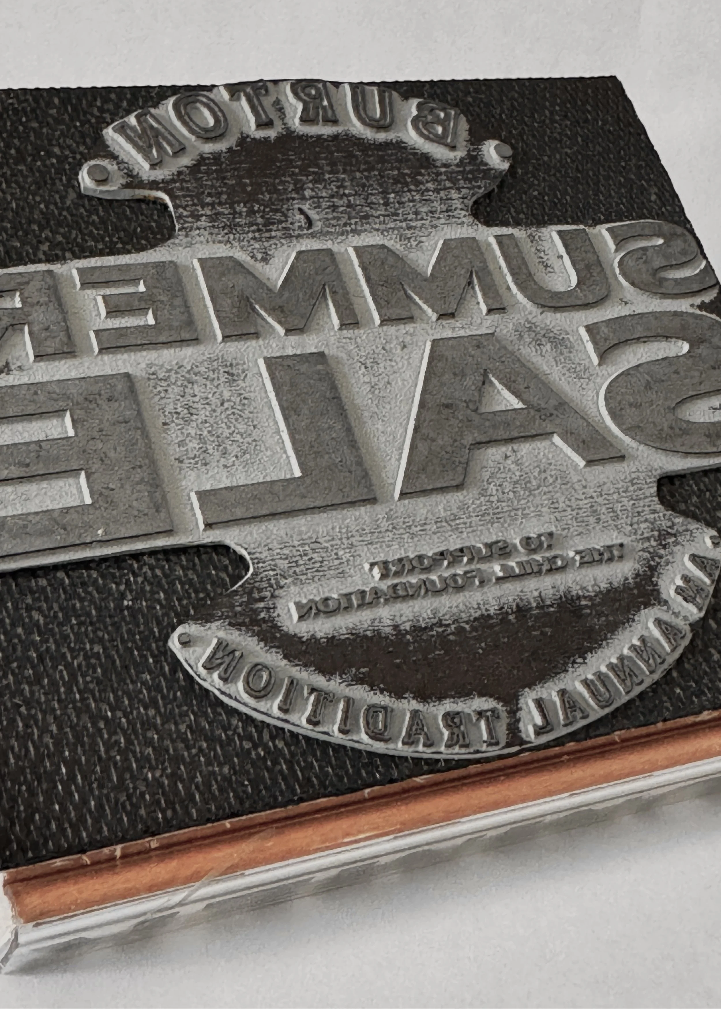
Burton Summer Sale
IT’S NOT JUST A SALE,
IT’S A FEELING
IT’S NOT JUST A SALE,
IT’S A FEELING
A long-term visual system designed to evolve over 3–5 years, built on warm, vintage-inspired typography, distressed graphic elements, and sun-worn photography. The goal was to create a Summer Sale identity that feels familiar, effortless, and rooted in real seasonal moments. Flexible across digital, in-store, and out-of-home placements, the system maintains consistency while allowing for variation, keeping the campaign recognizable without feeling repetitive.
Burton Summer Sale


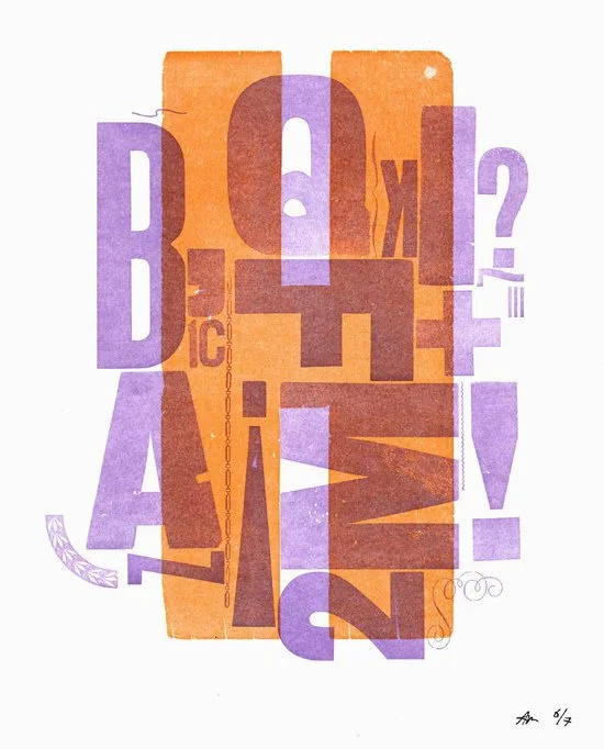


Sketching is part of my process. It’s the quickest way to get ideas out, pressure-test directions early, and make sure the work is focused before moving into refinement.


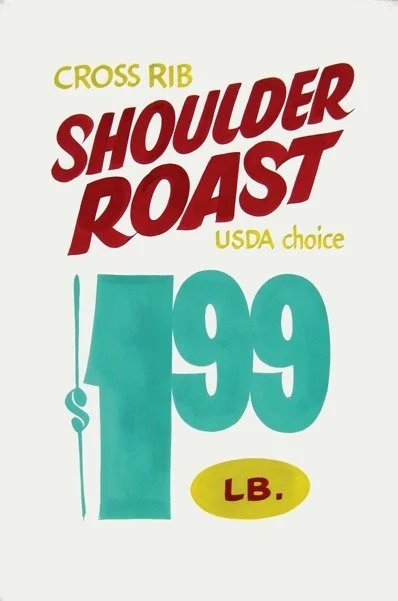
This identity was designed to age well. Bold type, stamp textures, and a restrained color palette create a system that feels familiar year after year. Photography was intentionally treated with gradients and noise, keeping the focus on the message while allowing the identity to stay consistent, even as products change.
Built for
Repeat Summers


Key Artwork

Finished assets
Website Assets
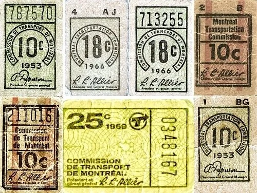
VIP/Employee Tickets
Social Media Assets
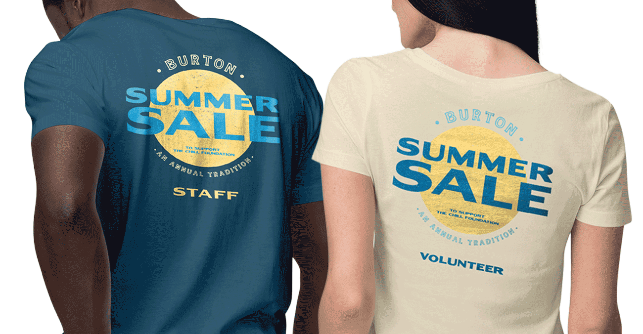
Employee Uniforms
Environmental Signage
Local Magazine Ads
Spotify Ads
Poster